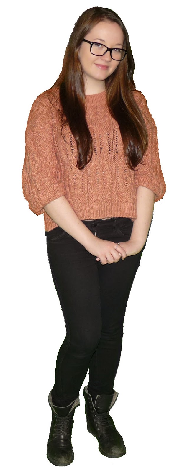
Since the last post I've added the main image onto the page. I used the same process as my cover to cut out the image and remove the tint.
Monday, 24 November 2014
Thursday, 20 November 2014
Contents Page Progress 1
I've now started to work on my contents page and decided on the colour scheme. I've split the page in two and made the right hand side the same colour as the cover and the left hand side a light grey colour. I will use the right hand side of the page to write the stories and the left hand side to write a top ten list which is similar to Billboard. I also added the titles off of 1001 fonts.
Magazine Cover Progress 5
Since my last post to fill up the cover slightly I added a smaller image into a white box in the towards the top of the page and added a relating cover line; which will once again relate to my target audience. To make the box stand out on the page I added a drop shadow. I also moved the cover lines around the page to allow space for the image.
Magazine Cover Progress 4
Since my last post I've added more story lines to my cover which my target audience will be interested in and focuses on celebrities that my primary audience are also interested in.
I used the same colour on the names of the celebrities that is on the cover stars jumper to create a house style.
Tuesday, 18 November 2014
Photoshop Work On Cover Image
I used the following image for my cover, the photo was took in the school green room to make sure that the image stood out when cut out on Photoshop.
Firstly I cut out the image using the magic eraser tool which got deleted the majority of the green background but leaving a tint around the main image.
I used the eye dropper tool to select a colour similar to what it would be if it wasn't for the green tint. I then used the colour replacement tool to go over the tint.
I continued this process throughout the image to achieve the final image.
Magazine Cover Progress 2
Since my last post I've now added the image of my cover star and added the associating story line. the font is once again off of 1001fonts.com. to cut out the image I used Photoshop, which is on the next blog post.
Monday, 17 November 2014
Magazine Cover Progress 1
Today I started the process of beginning my magazine. So far I've added the font and chosen the colour scheme of a light blue background with white font. I got the font off the website 1001 fonts. I went for a white font over black as it stood out more against the lighter background.
Thursday, 13 November 2014
Reviewed Flat Plans: Cover Page
After looking into my style model I decided to review my flat plans for my magazine as well as decide on key features such as the font styles and background colours.
Cover Page:
Reviewed Flat Plans: Double Page Spread
After looking into my style model I decided to review my flat plans for my magazine as well as decide on key features such as the font styles and background colours.
Reviewed Flat Plans: Contents Page
After looking into my style model I decided to review my flat plans for my magazine as well as decide on key features such as the font styles and background colours.
Contents Page:
Contents Page:
Photo Ideas
For my photos I plan on using someone from my class. I will take a number of images that are based on the following magazine covers and double page spread. The images are based on Taylor Swift as she is a well known pop artist who has many fans.
Thursday, 6 November 2014
Flat Plan Ideas
These are my mock ups for my flat plans of my front cover, the contents page and double page spread. They were created on Microsoft Word and uploaded with slideshare.
Front Cover:
Contents Page:
Double Page Spread:
Front Cover:
Contents Page:
Double Page Spread:
Sunday, 2 November 2014
Photograph Analysis
I analysed two images, one of a building and another of a person, prior to taking my own images to use on my magazine.
Subscribe to:
Comments (Atom)


.JPG)


%2Bedited.jpg)


